Despite the distinct lack of development via public blog posts, there's still plenty going on.
I have completed a photoshoot where we set up a band at college, and I experimented with different light settings.
Last week I was in La Ferté Macé, France. Whilst I was there I attended a rock concert and got some photos of the crowd/stage/band. They might not be good enough quality for a cover but I think they are suitable and of sufficient quality for a small image on the contents page or as a double page spread.
I will post some of these photos up and I will decide very soon on the images I will be using on the cover. The article for the double page spread is very nearly complete. I have also decided on the layout of all pages of the magazine that I will be developing.
Sunday, 27 February 2011
Friday, 11 February 2011
Cover Ideas
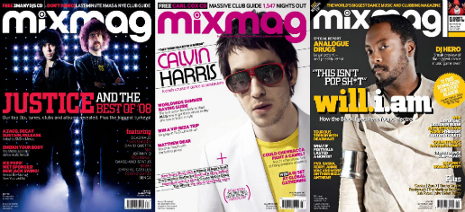
At the moment I don't really have any suitable images for a electronic-genre music magazine, and I'm struggling for ideas. Today I hope to take some photos but first I've been looking at back issues of ATM and Mixmag - hopefully these will give me some inspiration for my photos and ultimately the main content of the cover page. I've also looked at some gallery shots of tours from some electronic artists.
Here are some images/covers I liked:

I like the use of bold colours and lights in these covers, really helps to show off the artist and the bold coverlines are eye-catching.
My ideas for my cover have included band shots, crowds, with some custom lighting (lasers, strobe lights that could be digitally added to the photo). Here are some examples that I found from a photo album of deadmau5's UK winter tour in 2010
Here are some images/covers I liked:

I like the use of bold colours and lights in these covers, really helps to show off the artist and the bold coverlines are eye-catching.
My ideas for my cover have included band shots, crowds, with some custom lighting (lasers, strobe lights that could be digitally added to the photo). Here are some examples that I found from a photo album of deadmau5's UK winter tour in 2010
Friday, 4 February 2011
A feature
Same content in both of the above articles, just an idea for a feature at the moment. Let me know what you think of it. The photos have been edited with bright colours to match the aesthetic of the magazine. I will probably either use this and add a similar interview on the opposite page or use a wider image and impose a larger quantity of text on it.
Layout Designs
I've created a couple of potential layout designs for the cover, contents and double page spread pages
Please let me know what you think, for example your opinions on the size of the sections/too much white space/stuff to add
Thanks
Please let me know what you think, for example your opinions on the size of the sections/too much white space/stuff to add
Thanks
Top - Cover Layouts
Middle - Contents Page Layouts
Bottom - Double Page Spread Layouts
Middle - Contents Page Layouts
Bottom - Double Page Spread Layouts
Subscribe to:
Posts (Atom)


