Friday, 11 March 2011

COVER = DONE


This is my (hopefully) finished first front cover draft. Please let me know what you think of it...

Thursday, 10 March 2011

Cover - In the making...

I've been working on the cover page for the last couple of days using the Adobe Photoshop CS5 software. I've been learning loads of stuff along the way, and took on a fair bit of know-how from the similar Elements program I used to create the double page spread.

Rather than find an image that shows live band/music I've decided to go for a simple subject person on my front cover, slightly offset to the right to allow for coverline space. We did the photo-shoot for this last week with Steve (who features on the cover) stood in front of a white wall. This made the photo easier to work with later on as I could then crop Steve from the image and place a background behind him.

This was the photo I chose out of around 15 to use on my front cover...I cropped Steve using the magnetic lasso tool and afterwards the background eraser tool with a small brush. I then changed the hue, saturation and contrast of Steve to make him a look a little more radiant and more suitable for the front cover of a magazine. I created a shadow behind Steve by selecting the cropped-out Steve, feathering it by 30px, painting it black and finally altering the opacity to 70%.


This feathering effect to create a subtle shadow was also used behind the text box created for the coverlines. This helped to visually separate them from the background graphic, rather than have no visual difference between the two and just having a general conglomeration of colours which would not have been easy on the eye.

I went for a colourful, eye-catching background graphic and general colour scheme. I thought it may be a good idea to match the cover image (namely Steve's clothes) with the colour scheme, so I used a pink/green/blue scheme with some small black/white chequered areas. The background image was created using the '80's Kung Fu' photoshop brushes that I downloaded from BrushKing.

The draft of the cover I've almost finished making (with just minor additions - it's text for the coverlines, strapline,  price) is very intricately designed and has around twelve layers with each particular area of the cover on it, for example Steve + the shadow is on a completely different layer to the masthead, strapline, coverline text box and background graphic.

I think the mad colour scheme and the lighting effects I added to the masthead/title works well in keeping with the electronic music theme and the name of the magazine 'Strobe' is very fitting.

So here is what I have so far:


Just a couple of questions to ask you,

- Should I keep the same colour scheme and use it in elements of the contents page and the DPS?

- In your opinion, how could it be improved?

Friday, 4 March 2011

DPS = DONE

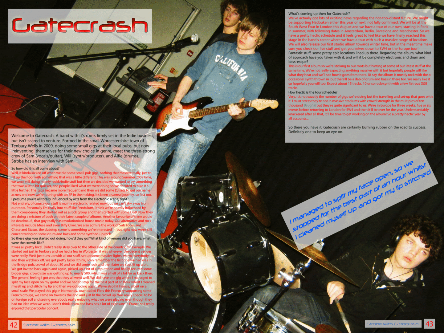
Please let me know what you think of the edits to the double page spread. I hope to have finished it now, but if you have any ideas on how I could improve it please let me know via comments :)


I've done a version with the quote in two different places and completely without it, which do you prefer?


(Click on the image to view full-size)


Thank you!!

Sunday, 27 February 2011

Taking Shape

Despite the distinct lack of development via public blog posts, there's still plenty going on.

I have completed a photoshoot where we set up a band at college, and I experimented with different light settings.

Last week I was in La Ferté Macé, France. Whilst I was there I attended a rock concert and got some photos of the crowd/stage/band. They might not be good enough quality for a cover but I think they are suitable and of sufficient quality for a small image on the contents page or as a double page spread.

I will post some of these photos up and I will decide very soon on the images I will be using on the cover. The article for the double page spread is very nearly complete. I have also decided on the layout of all pages of the magazine that I will be developing.

Friday, 11 February 2011

Cover Ideas

At the moment I don't really have any suitable images for a electronic-genre music magazine, and I'm struggling for ideas. Today I hope to take some photos but first I've been looking at back issues of ATM and Mixmag - hopefully these will give me some inspiration for my photos and ultimately the main content of the cover page. I've also looked at some gallery shots of tours from some electronic artists.

Here are some images/covers I liked:

Photobucket


I like the use of bold colours and lights in these covers, really helps to show off the artist and the bold coverlines are eye-catching.

My ideas for my cover have included band shots, crowds, with some custom lighting (lasers, strobe lights that could be digitally added to the photo). Here are some examples that I found from a photo album of deadmau5's UK winter tour in 2010


Friday, 4 February 2011

A feature


Same content in both of the above articles, just an idea for a feature at the moment. Let me know what you think of it. The photos have been edited  with bright colours to match the aesthetic of the magazine. I will probably either use this and add a similar interview on the opposite page or use a wider image and impose a larger quantity of text on it.

Layout Designs

I've created a couple of potential layout designs for the cover, contents and double page spread pages
Please let me know what you think, for example your opinions on the size of the sections/too much white space/stuff to add

Thanks

Top - Cover Layouts
Middle - Contents Page Layouts
Bottom - Double Page Spread Layouts