Looking back at your preliminary task, what do you feel you have learnt in the progression from it to the full product?
I feel that there has been a very large progression in my skills using digital technologies from when I started the prelim task to when I completed this task.
I have developed my graphics skills and I have therefore been able to create a much better, more professional, more aesthetically pleasing looking magazine cover, contents page and double page spread by using Photoshop, as opposed to the basic editing tools available in Publisher which I used in the prelim task. With the tools available in Photoshop I feel that I was better equipped to reach out to a particular audience by using brush tools, render effects and a larger variety of colours to connote a genre.
I have set up a Facebook feedback group to gain audience comments as suggestions for improvements in the late and final stages of development rather than using comments on the blog and using polls and questionnaires. I feel that by setting a feedback group up on Facebook, it would have been much easier to gain feedback as more people are likely to see and use the group as they use the site regularly, whereas a questionnaire and/or poll is likely to be missed by people as they don't wish to spend extra time giving feedback.
Friday, 25 March 2011
Evaluation Question #6
What have you learnt about technologies from the process of constructing this product?
I have learnt a lot about the use of Photoshop CS5 and I have developed my skills using the software. It took some time to get used to using the Photoshop software, however despite the larger amount of time needed to accustom to it, I think it was better to use Photoshop as it offered a better graphics package to create an overall better quality set of magazine pages with the customisable brush styles and render effects.
Prior to this project in the preliminary task I created my magazine using Microsoft Office Publisher which didn't provide a great deal of graphic manipulation present in Photoshop.

During the process I have learnt a lot about presentation technologies. I have learnt how to use Prezi and Slideshare, two very useful sites which provide a new way of presenting research and evaluative materials. It looks much better using these two sites to either create a dynamic presentation or upload a Powerpoint to post on Blogger, than simply presenting ideas and development of the product via means of text and photos.
I have learnt a lot about the use of Photoshop CS5 and I have developed my skills using the software. It took some time to get used to using the Photoshop software, however despite the larger amount of time needed to accustom to it, I think it was better to use Photoshop as it offered a better graphics package to create an overall better quality set of magazine pages with the customisable brush styles and render effects.
Prior to this project in the preliminary task I created my magazine using Microsoft Office Publisher which didn't provide a great deal of graphic manipulation present in Photoshop.
Evaluation Question #5
How did you attract/address your audience?
I tried to attract my younger-orientated audience by using very bright colours in my magazine, particularly in the cover and contents pages. The front cover immediately establishes the target audience with the subject person and this may have an effect on the whether a potential reader may buy it on impulse when at the retailer. The mode of address is very informal which may also contribute to the effectiveness of reaching out to the target audience.
The imagery used in the contents page and the masthead connote a sense of party atmosphere and the lighting effects used allude to this too, a common trait of the electronic music scene. I posed the question to my Media Feedback group on Facebook, asking them (specifically selected members to represent my target audience mentioned in my previous blog post) if they thought the cover was effective and what they liked about it.
Audience feedback that I received was generally positive regarding the aesthetics of the magazine cover:

Evaluation Question #3
What kind of media institution might distribute your media product and why?
There aren’t many magazines such as the one I have created in the market, for example ones that specifically focus on this particular genre of music. My magazine offers younger readers who like the electronic genre of music a good-quality magazine that is interesting to read, nice to look at, and doesn’t break the bank when it comes to buying it. A media company hoping to sell more to a younger audience may wish to take up distributing Strobe magazine.

There aren’t many magazines such as the one I have created in the market, for example ones that specifically focus on this particular genre of music. My magazine offers younger readers who like the electronic genre of music a good-quality magazine that is interesting to read, nice to look at, and doesn’t break the bank when it comes to buying it. A media company hoping to sell more to a younger audience may wish to take up distributing Strobe magazine.
An example of an institution may be the distributors of Q magazine, the Bauer Media Group. There is a gap in the market for magazines directly aimed at the electronic genre, and Bauer Group's experience in selling and distributing a renowned magazine such as Q would be perfect to begin a successful business whilst diffusing a magazine to masses of fans of electronic music all over the UK.
Evaluation Question #2
How does your media product represent particular social groups?
On the front cover, a member of my target audience is portrayed as the subject of the front cover. Instantly someone who an audience can relate to, he is listening to music, wearing DC clothing, stood in front of a colourful palette. This house style of the cover adds up to represent the young adult and teenage audience as a mainly hedonist crowd who enjoy listening to music, mainly of the electronic genre.

I have aimed to represent a young audience through my chosen genre of electronic rock. This is an increasingly popular genre amongst teenagers and younger adults, and the front cover image represents my chosen audience well through showing a typical teenage reader. I have used images in my magazine however I think there is more text. I have included pictures on the contents page to add to the content and break up the text and make it nicer to look at, and I have included a large background image on the double page spread. The photo on the DPS shows a youthful band in live session, the demographic of which my audience could relate to.

The magazine shows a laid back and informal quality with sans-serif artistic fonts, very colourful background graphics with light effects (such as the Lens Flare on the cover masthead, and the lighting used on the background graphics on the contents page). Magazines that try to show good-quality and possibly value for money, such as Q which focuses on the indie/rock genre, use a calmer colour palette and some serif fonts in their titles. However these magazines are often for an older audience so I decided that I would not go for this approach and try something a little more graphically imaginative.
Monday, 14 March 2011
The completed set
So for ease of readers here's my completed set of;
Cover
Contents page
Double page spread (I decided to go for the one with no quote. Avoided having to look at it on an angle. I also checked the spelling and grammar...)
Also the image sizes are pretty huge so you may want to wait for them to load ;-)


Cover
Contents page
Double page spread (I decided to go for the one with no quote. Avoided having to look at it on an angle. I also checked the spelling and grammar...)
Also the image sizes are pretty huge so you may want to wait for them to load ;-)


CONTENTS = DONE
Here's my contents page. I tried to maintain the same colourful theme as the cover page and tried to stick to the layouts I proposed earlier.


Friday, 11 March 2011
COVER = DONE

This is my (hopefully) finished first front cover draft. Please let me know what you think of it...
Thursday, 10 March 2011
Cover - In the making...
I've been working on the cover page for the last couple of days using the Adobe Photoshop CS5 software. I've been learning loads of stuff along the way, and took on a fair bit of know-how from the similar Elements program I used to create the double page spread.
Rather than find an image that shows live band/music I've decided to go for a simple subject person on my front cover, slightly offset to the right to allow for coverline space. We did the photo-shoot for this last week with Steve (who features on the cover) stood in front of a white wall. This made the photo easier to work with later on as I could then crop Steve from the image and place a background behind him.
 This was the photo I chose out of around 15 to use on my front cover...I cropped Steve using the magnetic lasso tool and afterwards the background eraser tool with a small brush. I then changed the hue, saturation and contrast of Steve to make him a look a little more radiant and more suitable for the front cover of a magazine. I created a shadow behind Steve by selecting the cropped-out Steve, feathering it by 30px, painting it black and finally altering the opacity to 70%.
This feathering effect to create a subtle shadow was also used behind the text box created for the coverlines. This helped to visually separate them from the background graphic, rather than have no visual difference between the two and just having a general conglomeration of colours which would not have been easy on the eye.
I went for a colourful, eye-catching background graphic and general colour scheme. I thought it may be a good idea to match the cover image (namely Steve's clothes) with the colour scheme, so I used a pink/green/blue scheme with some small black/white chequered areas. The background image was created using the '80's Kung Fu' photoshop brushes that I downloaded from BrushKing.
The draft of the cover I've almost finished making (with just minor additions - it's text for the coverlines, strapline, price) is very intricately designed and has around twelve layers with each particular area of the cover on it, for example Steve + the shadow is on a completely different layer to the masthead, strapline, coverline text box and background graphic.
I think the mad colour scheme and the lighting effects I added to the masthead/title works well in keeping with the electronic music theme and the name of the magazine 'Strobe' is very fitting.
So here is what I have so far:

Just a couple of questions to ask you,
- Should I keep the same colour scheme and use it in elements of the contents page and the DPS?
- In your opinion, how could it be improved?
Rather than find an image that shows live band/music I've decided to go for a simple subject person on my front cover, slightly offset to the right to allow for coverline space. We did the photo-shoot for this last week with Steve (who features on the cover) stood in front of a white wall. This made the photo easier to work with later on as I could then crop Steve from the image and place a background behind him.

This feathering effect to create a subtle shadow was also used behind the text box created for the coverlines. This helped to visually separate them from the background graphic, rather than have no visual difference between the two and just having a general conglomeration of colours which would not have been easy on the eye.
I went for a colourful, eye-catching background graphic and general colour scheme. I thought it may be a good idea to match the cover image (namely Steve's clothes) with the colour scheme, so I used a pink/green/blue scheme with some small black/white chequered areas. The background image was created using the '80's Kung Fu' photoshop brushes that I downloaded from BrushKing.
The draft of the cover I've almost finished making (with just minor additions - it's text for the coverlines, strapline, price) is very intricately designed and has around twelve layers with each particular area of the cover on it, for example Steve + the shadow is on a completely different layer to the masthead, strapline, coverline text box and background graphic.
I think the mad colour scheme and the lighting effects I added to the masthead/title works well in keeping with the electronic music theme and the name of the magazine 'Strobe' is very fitting.
So here is what I have so far:

Just a couple of questions to ask you,
- Should I keep the same colour scheme and use it in elements of the contents page and the DPS?
- In your opinion, how could it be improved?
Friday, 4 March 2011
DPS = DONE
Please let me know what you think of the edits to the double page spread. I hope to have finished it now, but if you have any ideas on how I could improve it please let me know via comments :)

I've done a version with the quote in two different places and completely without it, which do you prefer?


(Click on the image to view full-size)
Thank you!!
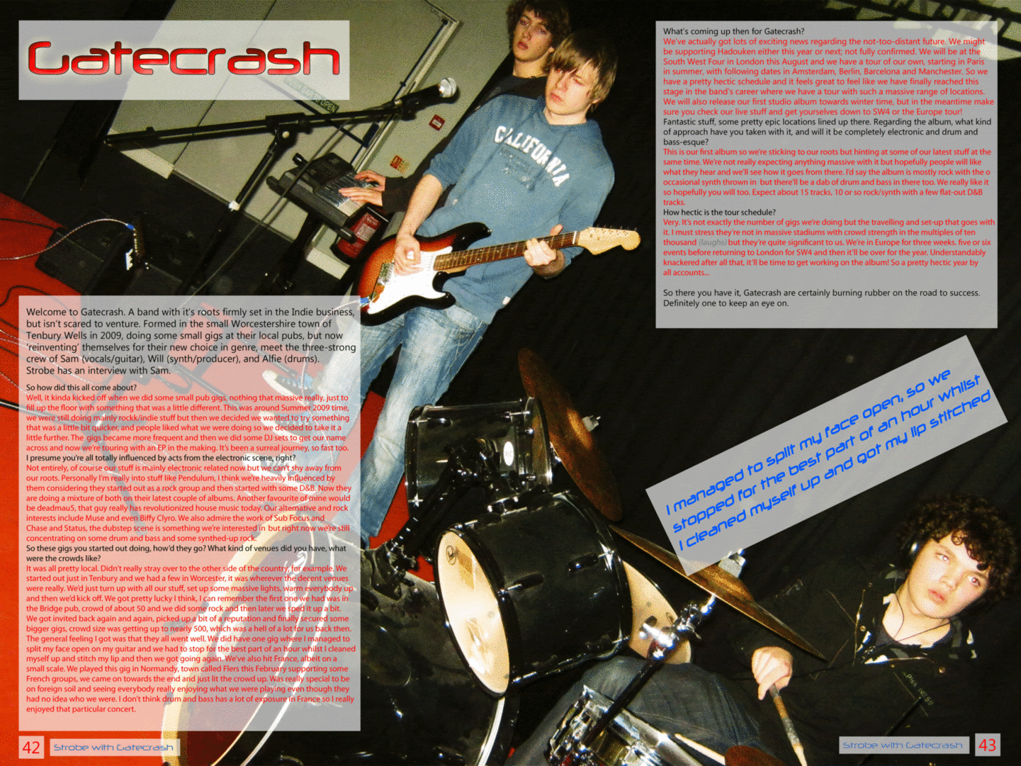
I've done a version with the quote in two different places and completely without it, which do you prefer?


(Click on the image to view full-size)
Thank you!!
Subscribe to:
Posts (Atom)