Looking back at your preliminary task, what do you feel you have learnt in the progression from it to the full product?
I feel that there has been a very large progression in my skills using digital technologies from when I started the prelim task to when I completed this task.
I have developed my graphics skills and I have therefore been able to create a much better, more professional, more aesthetically pleasing looking magazine cover, contents page and double page spread by using Photoshop, as opposed to the basic editing tools available in Publisher which I used in the prelim task. With the tools available in Photoshop I feel that I was better equipped to reach out to a particular audience by using brush tools, render effects and a larger variety of colours to connote a genre.
I have set up a Facebook feedback group to gain audience comments as suggestions for improvements in the late and final stages of development rather than using comments on the blog and using polls and questionnaires. I feel that by setting a feedback group up on Facebook, it would have been much easier to gain feedback as more people are likely to see and use the group as they use the site regularly, whereas a questionnaire and/or poll is likely to be missed by people as they don't wish to spend extra time giving feedback.
Friday, 25 March 2011
Evaluation Question #6
What have you learnt about technologies from the process of constructing this product?
I have learnt a lot about the use of Photoshop CS5 and I have developed my skills using the software. It took some time to get used to using the Photoshop software, however despite the larger amount of time needed to accustom to it, I think it was better to use Photoshop as it offered a better graphics package to create an overall better quality set of magazine pages with the customisable brush styles and render effects.
Prior to this project in the preliminary task I created my magazine using Microsoft Office Publisher which didn't provide a great deal of graphic manipulation present in Photoshop.

During the process I have learnt a lot about presentation technologies. I have learnt how to use Prezi and Slideshare, two very useful sites which provide a new way of presenting research and evaluative materials. It looks much better using these two sites to either create a dynamic presentation or upload a Powerpoint to post on Blogger, than simply presenting ideas and development of the product via means of text and photos.
I have learnt a lot about the use of Photoshop CS5 and I have developed my skills using the software. It took some time to get used to using the Photoshop software, however despite the larger amount of time needed to accustom to it, I think it was better to use Photoshop as it offered a better graphics package to create an overall better quality set of magazine pages with the customisable brush styles and render effects.
Prior to this project in the preliminary task I created my magazine using Microsoft Office Publisher which didn't provide a great deal of graphic manipulation present in Photoshop.
Evaluation Question #5
How did you attract/address your audience?
I tried to attract my younger-orientated audience by using very bright colours in my magazine, particularly in the cover and contents pages. The front cover immediately establishes the target audience with the subject person and this may have an effect on the whether a potential reader may buy it on impulse when at the retailer. The mode of address is very informal which may also contribute to the effectiveness of reaching out to the target audience.
The imagery used in the contents page and the masthead connote a sense of party atmosphere and the lighting effects used allude to this too, a common trait of the electronic music scene. I posed the question to my Media Feedback group on Facebook, asking them (specifically selected members to represent my target audience mentioned in my previous blog post) if they thought the cover was effective and what they liked about it.
Audience feedback that I received was generally positive regarding the aesthetics of the magazine cover:

Evaluation Question #3
What kind of media institution might distribute your media product and why?
There aren’t many magazines such as the one I have created in the market, for example ones that specifically focus on this particular genre of music. My magazine offers younger readers who like the electronic genre of music a good-quality magazine that is interesting to read, nice to look at, and doesn’t break the bank when it comes to buying it. A media company hoping to sell more to a younger audience may wish to take up distributing Strobe magazine.

There aren’t many magazines such as the one I have created in the market, for example ones that specifically focus on this particular genre of music. My magazine offers younger readers who like the electronic genre of music a good-quality magazine that is interesting to read, nice to look at, and doesn’t break the bank when it comes to buying it. A media company hoping to sell more to a younger audience may wish to take up distributing Strobe magazine.
An example of an institution may be the distributors of Q magazine, the Bauer Media Group. There is a gap in the market for magazines directly aimed at the electronic genre, and Bauer Group's experience in selling and distributing a renowned magazine such as Q would be perfect to begin a successful business whilst diffusing a magazine to masses of fans of electronic music all over the UK.
Evaluation Question #2
How does your media product represent particular social groups?
On the front cover, a member of my target audience is portrayed as the subject of the front cover. Instantly someone who an audience can relate to, he is listening to music, wearing DC clothing, stood in front of a colourful palette. This house style of the cover adds up to represent the young adult and teenage audience as a mainly hedonist crowd who enjoy listening to music, mainly of the electronic genre.

I have aimed to represent a young audience through my chosen genre of electronic rock. This is an increasingly popular genre amongst teenagers and younger adults, and the front cover image represents my chosen audience well through showing a typical teenage reader. I have used images in my magazine however I think there is more text. I have included pictures on the contents page to add to the content and break up the text and make it nicer to look at, and I have included a large background image on the double page spread. The photo on the DPS shows a youthful band in live session, the demographic of which my audience could relate to.

The magazine shows a laid back and informal quality with sans-serif artistic fonts, very colourful background graphics with light effects (such as the Lens Flare on the cover masthead, and the lighting used on the background graphics on the contents page). Magazines that try to show good-quality and possibly value for money, such as Q which focuses on the indie/rock genre, use a calmer colour palette and some serif fonts in their titles. However these magazines are often for an older audience so I decided that I would not go for this approach and try something a little more graphically imaginative.
Monday, 14 March 2011
The completed set
So for ease of readers here's my completed set of;
Cover
Contents page
Double page spread (I decided to go for the one with no quote. Avoided having to look at it on an angle. I also checked the spelling and grammar...)
Also the image sizes are pretty huge so you may want to wait for them to load ;-)


Cover
Contents page
Double page spread (I decided to go for the one with no quote. Avoided having to look at it on an angle. I also checked the spelling and grammar...)
Also the image sizes are pretty huge so you may want to wait for them to load ;-)


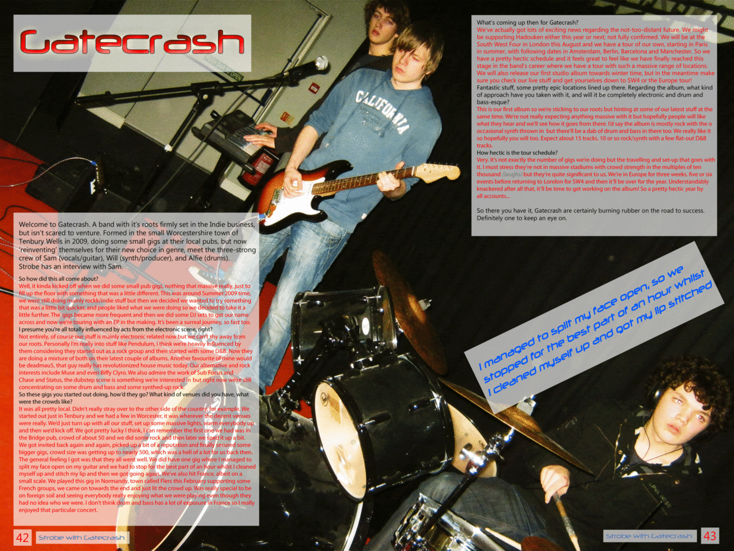
CONTENTS = DONE
Here's my contents page. I tried to maintain the same colourful theme as the cover page and tried to stick to the layouts I proposed earlier.


Friday, 11 March 2011
COVER = DONE

This is my (hopefully) finished first front cover draft. Please let me know what you think of it...
Thursday, 10 March 2011
Cover - In the making...
I've been working on the cover page for the last couple of days using the Adobe Photoshop CS5 software. I've been learning loads of stuff along the way, and took on a fair bit of know-how from the similar Elements program I used to create the double page spread.
Rather than find an image that shows live band/music I've decided to go for a simple subject person on my front cover, slightly offset to the right to allow for coverline space. We did the photo-shoot for this last week with Steve (who features on the cover) stood in front of a white wall. This made the photo easier to work with later on as I could then crop Steve from the image and place a background behind him.
 This was the photo I chose out of around 15 to use on my front cover...I cropped Steve using the magnetic lasso tool and afterwards the background eraser tool with a small brush. I then changed the hue, saturation and contrast of Steve to make him a look a little more radiant and more suitable for the front cover of a magazine. I created a shadow behind Steve by selecting the cropped-out Steve, feathering it by 30px, painting it black and finally altering the opacity to 70%.
This feathering effect to create a subtle shadow was also used behind the text box created for the coverlines. This helped to visually separate them from the background graphic, rather than have no visual difference between the two and just having a general conglomeration of colours which would not have been easy on the eye.
I went for a colourful, eye-catching background graphic and general colour scheme. I thought it may be a good idea to match the cover image (namely Steve's clothes) with the colour scheme, so I used a pink/green/blue scheme with some small black/white chequered areas. The background image was created using the '80's Kung Fu' photoshop brushes that I downloaded from BrushKing.
The draft of the cover I've almost finished making (with just minor additions - it's text for the coverlines, strapline, price) is very intricately designed and has around twelve layers with each particular area of the cover on it, for example Steve + the shadow is on a completely different layer to the masthead, strapline, coverline text box and background graphic.
I think the mad colour scheme and the lighting effects I added to the masthead/title works well in keeping with the electronic music theme and the name of the magazine 'Strobe' is very fitting.
So here is what I have so far:

Just a couple of questions to ask you,
- Should I keep the same colour scheme and use it in elements of the contents page and the DPS?
- In your opinion, how could it be improved?
Rather than find an image that shows live band/music I've decided to go for a simple subject person on my front cover, slightly offset to the right to allow for coverline space. We did the photo-shoot for this last week with Steve (who features on the cover) stood in front of a white wall. This made the photo easier to work with later on as I could then crop Steve from the image and place a background behind him.

This feathering effect to create a subtle shadow was also used behind the text box created for the coverlines. This helped to visually separate them from the background graphic, rather than have no visual difference between the two and just having a general conglomeration of colours which would not have been easy on the eye.
I went for a colourful, eye-catching background graphic and general colour scheme. I thought it may be a good idea to match the cover image (namely Steve's clothes) with the colour scheme, so I used a pink/green/blue scheme with some small black/white chequered areas. The background image was created using the '80's Kung Fu' photoshop brushes that I downloaded from BrushKing.
The draft of the cover I've almost finished making (with just minor additions - it's text for the coverlines, strapline, price) is very intricately designed and has around twelve layers with each particular area of the cover on it, for example Steve + the shadow is on a completely different layer to the masthead, strapline, coverline text box and background graphic.
I think the mad colour scheme and the lighting effects I added to the masthead/title works well in keeping with the electronic music theme and the name of the magazine 'Strobe' is very fitting.
So here is what I have so far:

Just a couple of questions to ask you,
- Should I keep the same colour scheme and use it in elements of the contents page and the DPS?
- In your opinion, how could it be improved?
Friday, 4 March 2011
DPS = DONE
Please let me know what you think of the edits to the double page spread. I hope to have finished it now, but if you have any ideas on how I could improve it please let me know via comments :)

I've done a version with the quote in two different places and completely without it, which do you prefer?


(Click on the image to view full-size)
Thank you!!
I've done a version with the quote in two different places and completely without it, which do you prefer?


(Click on the image to view full-size)
Thank you!!
Sunday, 27 February 2011
Taking Shape
Despite the distinct lack of development via public blog posts, there's still plenty going on.
I have completed a photoshoot where we set up a band at college, and I experimented with different light settings.
Last week I was in La Ferté Macé, France. Whilst I was there I attended a rock concert and got some photos of the crowd/stage/band. They might not be good enough quality for a cover but I think they are suitable and of sufficient quality for a small image on the contents page or as a double page spread.
I will post some of these photos up and I will decide very soon on the images I will be using on the cover. The article for the double page spread is very nearly complete. I have also decided on the layout of all pages of the magazine that I will be developing.
Friday, 11 February 2011
Cover Ideas
At the moment I don't really have any suitable images for a electronic-genre music magazine, and I'm struggling for ideas. Today I hope to take some photos but first I've been looking at back issues of ATM and Mixmag - hopefully these will give me some inspiration for my photos and ultimately the main content of the cover page. I've also looked at some gallery shots of tours from some electronic artists.
Here are some images/covers I liked:

I like the use of bold colours and lights in these covers, really helps to show off the artist and the bold coverlines are eye-catching.
My ideas for my cover have included band shots, crowds, with some custom lighting (lasers, strobe lights that could be digitally added to the photo). Here are some examples that I found from a photo album of deadmau5's UK winter tour in 2010


Friday, 4 February 2011
A feature


Same content in both of the above articles, just an idea for a feature at the moment. Let me know what you think of it. The photos have been edited with bright colours to match the aesthetic of the magazine. I will probably either use this and add a similar interview on the opposite page or use a wider image and impose a larger quantity of text on it.
Layout Designs
I've created a couple of potential layout designs for the cover, contents and double page spread pages
Please let me know what you think, for example your opinions on the size of the sections/too much white space/stuff to add
Thanks


Please let me know what you think, for example your opinions on the size of the sections/too much white space/stuff to add
Thanks
Top - Cover Layouts
Middle - Contents Page Layouts
Bottom - Double Page Spread Layouts
Middle - Contents Page Layouts
Bottom - Double Page Spread Layouts


Friday, 28 January 2011
Fonts
Today I have been looking at fonts that I could use for the Strobe masthead, I don't have a particular preference, so let me know which one you like best


Wednesday, 26 January 2011
Circulation Figures
In 2010 it was announced from ABC figures that Mojo had become the top-selling music magazine. It emerged that Q had lost 8% of it's audience in the previous year, and NME magazine had lost 21% of it's audience in the same time period.
Since my magazine is targeting a niche market, particularly the electronic music genre, it may attract readers who have stopped reading the other magazines.
From the Guardian:
http://www.guardian.co.uk/media/2010/feb/11/mojo-q-nme-kerrang-abcs
Mojo has overtaken its sister title Q to become the biggest-circulation paid-for music magazine, while there were big drops for music titles New Musical Express, Kerrang! and Metal Hammer in the latest circulation figures out today.
Bauer Media's classic rock magazine Mojo had an average monthly circulation of 98,484 in the second half of last year, down 2% year on year but up 0.8% on the previous six months.
It overtook fellow Bauer title Q, which fell 8% year on year and 5.4% on the first half of the year to 94,811. There was better news for Q's sister title, film magazine Empire, which was up 2.4% year on year to 194,239. It stretched its already substantial lead over Future Publishing's Total Film, which was down 5.8% year on year to 81,029. IPC Media's Uncut held onto third place among the paid-for rock music titles, despite a 13.3% fall year on year to 75,518. It was ahead of Classic Rock, which was up 1.5% year on year and 1.3% on the first half of 2009 to 71,242.
But there were big year on year drops for the other titles in the rock music sector. Future Publishing's Metal Hammer was down 16.9% year on year and 9.2% on the previous six months to 41,777. It was just ahead of Bauer's rock title Kerrang!, which tumbled 21.3% year on year and 4.9% on the first half of 2009 to 41,125, while IPC's NME fell 20.6% year on year, and 6% on the previous six months, to 38,486.
Dance title Mixmag, owned by Development Hell, was also down, falling 13.4% year on year to 26,116. Development Hell's sister title, Word, was down 22.5% year on yearto 26,555. Channelfly Enterprises' free music monthly The Fly remained the music sector leader with an average distribution of 107,771, up 7.5% year on year.
The British Film Institute's Sight and Sound was up 0.6% on the previous year to 19,842. Future Plus's free film title, Odeon Magazine, was top of the film sector, with an average distribution of 205,380.
Saturday, 22 January 2011
Treatment
Magazine:
Strobe
Target Readership:
 Strobe covers all music under the electronic genre, including electronic rock, drum and bass, house and garage music. There is no particular gender that the magazine is aimed at but the target age group of the magazine is from 16 years to low 20s. The musical interests of the readers will include electronic music, by artists such as Pendulum, the Prodigy, Daft Punk, deadmau5, amongst others. The typical reader is someone who has a passion for generally fast-paced music or music with heavy beats.
 Form and style:
Strobe is an A4-sized magazine that contains interviews with electronic-artists, news and reviews of albums, gig information, and it will be brightly coloured with contrasting colours rather than a neat and easy-on-the-eye colour scheme, for example the red/white/silver gradient of Q magazine. This will hopefully have the effect of showing Strobe as a vibrant and magnanimous magazine that is a fresh and bright face to electronic music that is often overlooked. Often, featured artists will feature in a photoshoot for the front cover, and the coverlines, masthead and any banners will be bright and bold to attract attention. There will be many coverlines to imply there is a lot of content in the magazine, and as it sells for a RRP of £3, it will show the magazine is good value for money.
Themes and typical features:
As mentioned the main theme of the magazine will be the genre of electronic music. There will be interviews with artists and reviews of gigs, new albums and singles released, and news.
Potential advertisers:
The magazine will be able to feature adverts by manufacturers and businesses in the music industry. These could include retailers of music/band equipment, or retailers of music, for example Apple. Apple has made billions of dollars in selling their iPod music devices and in the iTunes online music store. There may be opportunities to advertise via means of competitions, such as offering their products as prizes.
Wednesday, 19 January 2011
Textual Analysis
Cover
 This October 2009 issue of Q Magazine has a prominent cover in that it shows Matt Bellamy from Muse smashing his guitar against the Q logo. It has a very strong and bold colour pallette, with a background of a grey gradient and overlays of red, white and black.
The strapline of Q, 'The UK's bigger music magazine' hints that the magazine features good quality and popular artists. The coverlines of 'Muse- Matt Bellamy is out of control', and 'Rock's Greatest Nutjobs' possibly reflects the mood of the main image on the cover.
Contents Page

The contents page shown is from the January 2010 issue
This is a typical Q contents page. It uses the same colour pallette as the cover page, and also includes an image of the front cover in the top right of the page.
This particular issue was dedicated to a main feature called 'Artists of the Century', and the importance of this feature gives it a very large space on the contents page.

The strapline of Q, 'The UK's bigger music magazine' hints that the magazine features good quality and popular artists. The coverlines of 'Muse- Matt Bellamy is out of control', and 'Rock's Greatest Nutjobs' possibly reflects the mood of the main image on the cover.
Q is published by the Bauer Media Group, and was first issued in 1986. Originally it was to be called Cue (as in the sense of cueing a record, ready to play), but the name was changed so that it wouldn't be mistaken for a snooker magazine. Another reason, cited in Q's 200th edition, is that a single-letter title would be more prominent on newsstands.
The one strong image compounded by the simple and easy-on-the-eye yet bold colours gives an impression that the magazine is sophisticated yet will give a informative and entertaining read. The paper quality is very good, with glossy pages. This gives a collectable feel to it, a complete opposite to a cheaper magazine such as Kerrang! which doesn't have such a glossy and professional feel to it.
The small comment above the main coverline, "I bought 50 tins of beans and an axe", gives potential readers an insight into the featured article. In addition to the Muse banner/article there are many other artists featured, for example an article with 200 things you didn't know about the Beatles, which could attract the attention of any Beatles fans. The artists highlighted in the 'plus' coverline shows that Q has access to a wide variety of artists and the long list of artists there also implies you are getting a lot of content for your money.
Contents Page

The contents page shown is from the January 2010 issue
This is a typical Q contents page. It uses the same colour pallette as the cover page, and also includes an image of the front cover in the top right of the page.
This particular issue was dedicated to a main feature called 'Artists of the Century', and the importance of this feature gives it a very large space on the contents page.
It is divided into columns, with the aforementioned featured artists article contents on the left and other regular features on the right. A regular feature, the 'Q Review', has a large caption at the bottom of the page and is accompanied by a fairly large photo of a classic artist. This shows that Q will cater for a very wide range of artists, from many different eras.
Double Page Spread

Double Page Spread

This is the double page spread from an issue of Q featuring the Temper Trap band. It has a very simplistic layout and the background image takes on an almost sepia tone, making the serif font difficult to read in places however it gives the article a pleasant, soft read, it is easy on the eye and there are no clashing colours.
This particular article is very short in length and only gives basic information and facts, and very little in the form of interview and questions. In my article I will aim to create an authentic-looking interview feature that will be a lot longer and give a better insight into the workings and interests of the band.
Common features that this DPS has used that are typical of a lot of magazine features include;
- Drop cap at the start of the article
- Image captions
- Large long shot background image
Friday, 14 January 2011
Questionnaire
Please complete the questionnaire by posting a comment with your responses.
Many thanks
Magazine-related questions
1) How much money would you be willing to pay for a good quality music magazine?
Less than £1.50
£1.50 - £2.00
£2.00 - £2.50
£2.50 - £3.00
£3.00 - £4.00
More than £4
2) How often should the magazine be issued?
Weekly
Fortnightly
Monthly
Every other month
Other (please describe)
3) Which gender should the magazine be primarily targeted at?
Male
Female
Both
4) Which age bracket should the magazine be targeted at?
Less than 13 years
13-15
16-18
More than 18 years
5) Any other suggestions?
Music-related questions
6) What kind of music genre(s) do you like?
Rock/Alternative
Metal/Punk
Blues/Jazz
Electronic/House/Drum and Bass
R&B/Hip-hop
Pop
Classic
Other (please state)
7) Do you think a magazine should be dedicated to your selected genre or should have a mix of some/all?
8) Are there any artists/bands you particularly like?
9) Which of the following photo types would appeal to you in purchasing a music magazine?
Band/Artist photoshoot
Live performance
Equipment
Other (please describe)
Many thanks
Many thanks
Magazine-related questions
1) How much money would you be willing to pay for a good quality music magazine?
Less than £1.50
£1.50 - £2.00
£2.00 - £2.50
£2.50 - £3.00
£3.00 - £4.00
More than £4
2) How often should the magazine be issued?
Weekly
Fortnightly
Monthly
Every other month
Other (please describe)
3) Which gender should the magazine be primarily targeted at?
Male
Female
Both
4) Which age bracket should the magazine be targeted at?
Less than 13 years
13-15
16-18
More than 18 years
5) Any other suggestions?
Music-related questions
6) What kind of music genre(s) do you like?
Rock/Alternative
Metal/Punk
Blues/Jazz
Electronic/House/Drum and Bass
R&B/Hip-hop
Pop
Classic
Other (please state)
7) Do you think a magazine should be dedicated to your selected genre or should have a mix of some/all?
8) Are there any artists/bands you particularly like?
9) Which of the following photo types would appeal to you in purchasing a music magazine?
Band/Artist photoshoot
Live performance
Equipment
Other (please describe)
Many thanks
Name ideas
At the moment I'm thinking up what kind of any particular music genre my magazine will focus on, and I will name my magazine to match the style. My main interest in music is the house/electronic/D&B genre so this is the most likely genre that my magazine will cover.
Here are some potential names
Mixed
Synth
Dub
Drum
Strobe
Laser
Thump
Let me know by commenting which one you prefer, cheers
Here are some potential names
Mixed
Synth
Dub
Drum
Strobe
Laser
Thump
Let me know by commenting which one you prefer, cheers
Wednesday, 12 January 2011
Photoshoot
Due to the adverse weather conditions last week myself and Jake Vaughan went out into the snow like an expedition to the North Pole, took some photos that could be used and came back because it was too cold. We then went into the college music practice rooms and took more photos.
Here's a small sample. These photos may be too blurry or otherwise unsuitable for the final magazine feature so we will take more in the near future


Here's a small sample. These photos may be too blurry or otherwise unsuitable for the final magazine feature so we will take more in the near future

The music industry is a cold and lonely place

Drums n' stuff.

Who the hell is our new guitarist?


New guitar hero.

Which one is it again?

Wednesday, 5 January 2011
Part II + Plan of Action
After the preliminary task I will now be starting the main task which will involve creating a magazine cover, contents page and double-page spread for a music-themed magazine.
Action Plan;
03/01/11 - 21/01/11 - Research and Planning
3/1 - Action Plan
10/1 - Magazine Comparison
17/1 - Textual Analysis
17/1 - Internet Research on Readership Figures
24/01/11 - 25/02/11 - Construction
24/1 - Photo shoot
7/2 - Layout designs
14/2 - Treatment Sheet
14/2 - Drafting
28/02/11 - 11/03/11 - Evaluation
28/2 - Final Pages
7/3 - Feedback
7/3 - Evaluation
11/3 - Deadline
Subscribe to:
Posts (Atom)